TOC
Bob Ross’s Paintings from TV show “The Joy of Painting”
Before getting started
Source of Data :
First to all those people who are not aware of Bob Ross (like Me), he was an American Painter & TV host, his painted on his show & this dataset is born out of videos from his TV show
Read more about Bob Ross here and read about data set here
This data basically is of wide data format showcasing each episode & the elements of his paintings. Its a good excersize for someone looking to explore & work around wide data sets. It has 403 rows & 69 columns, hence classifying it as wide data
Based on structure of data, seeking to get answers for below based on dataset:
1. What were the famous elements in Bob Ross paintings?
2. Which elements were Bob Ross’s favorite in his paintings. Did it change over 31 seasons?
Lets get started
First step in analysinsg this type of data (i.e wide data) is to convert it to long format. Below code converts data in original format (as above) to long data as can be viewed below
bob_clean <-   bob %>%
  clean_names() %>%
  pivot_longer(c(-episode,-title),names_to = "Elements",values_to = "Times") %>%
  filter(Times==1) %>%
  mutate(title = str_to_title(str_remove_all(title, '"')),
         Elements = str_to_title(str_replace(Elements, "_", " ")))  %>%
  extract(episode, c("season", "episode_number"), "S(.*)E(.*)", convert = TRUE, remove = FALSE) %>%
  select(-Times) %>%
  mutate(Elements=fct_recode(Elements,
               "Trees" = "Tree")) %>%
  distinct()


reactable(bob_clean,
    defaultColDef = colDef(
    header = function(value) toupper(gsub("_", " ", value, fixed = TRUE)),
    cell = function(value) format(value, nsmall = 1),
    align = "center",
    minWidth = 120,
    headerStyle = list(background = "#a0a0de")
  ),
  columns = list(
    title = colDef(width = 300)
  ),
  wrap = FALSE, bordered = TRUE, highlight = TRUE,searchable = TRUE, minRows = 10,resizable = TRUE, outlined=TRUE, striped = TRUE)
Now this data is easier to analyse & can be utilised for various plotting behvaiour. Going back to our questions
2. Exploratory Data Analysis
1. Number of episodes & Seasons of the Joy of Painting
bob %>%
  extract(EPISODE,c("Season","Episode"),"S(.*)E(.*)") %>%
  select(Season,Episode) %>%
  group_by(Season) %>%
  mutate(Episode=as.numeric(Episode),num=max(Episode)) %>%
  filter(Episode==1) %>%
  ggplot(aes(Season,num,group=1))+
  geom_line()+
  labs(title="13 Episodes for 31 Seasons, Thats some consistency",
       x="Total Episodes")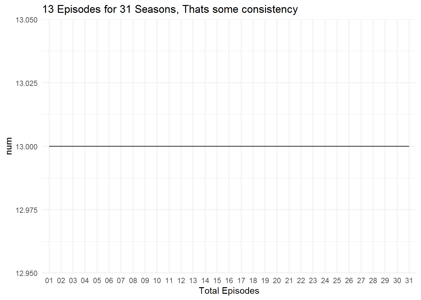
Figure 1: 31 Seasons & 13 episodes in each, Quite Consistent Mr.Ross
2. Which elements were Bob Ross’s favorite in his paintings. Did it change over 31 seasons?
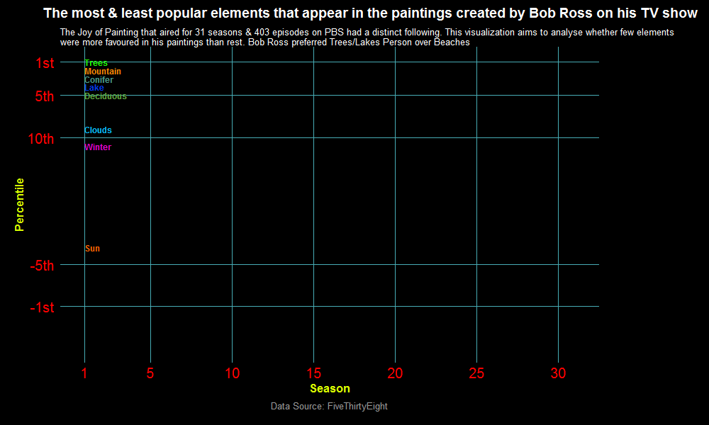
Figure 2: Rank plot showing most & least popular elements in Bob Ross paintings
comments powered by Disqus